Type : Fiction
Release : 27 September 2021
Auteur : Benjamin Dumond
Pdf : Grifi-2021-Agartha.pdf
apa : (2021, 27 Sep.). Deep down in Agartha. Grifi.fr. /en/articles/agartha

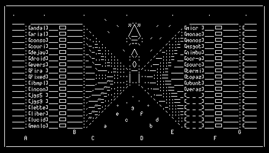
Illustration by Adel Faure (Twitter)
The type cases aligned in these underground galleries are contemporary. I say “contemporary” because I'm not able to describe them otherwise, but I would do more justice to what I see by saying that their aesthetics look like an optical illusion. Touching them gives me a kind of excitement about doubting my own time, as the atmosphere that radiates from the place where I am is anachronistic. Forged in black metal with iridescent reflections, their modernist sobriety is counterbalanced by frieze patterns whose inspiration could come as much from surrealist memes as from Dwiggins' spinach. I suspect that they contain fonts, but their contents remain invisible, firmly locked under a plate of the same dark metal. The only way to open them seems to be through a lock that their designer thought it would be funny to systematically place in a different area, so much so that it is impossible for me to find it in some cases. According to the person who receives me, the long galleries in which we evolve extend over several tens of kilometers, forming a closed circle occupied only by two rows of double-sided shelves on three levels. One breaker per level, six breakers per shelf, all lit by motion-sensing lamps whose faint purple light tints everything around us with a restful halo, moving at our pace as we make our way along this endless corridor.
“From here on out they're empty,” says -̹͚͗͒͒ͭ͞Ḧ̷̗̻̘́̏̎A̦͈̓̈͡-̴̙͕̦͈͔̗̱̖̅, pointing to an open case. “Today, less than 1% of the space is occupied. There is still room for another 51,000 years of typefaces.”
My brain freezes in respond to the nonsense of the announced numbers, and my gaze prefers to abandon itself looking at the end of the corridor, whose turn fades into the darkness. I end up rebooting, suddenly distressed by the idea that maybe I shouldn't have come here. -̹͚͗͒͒ͭ͞Ḧ̷̗̻̘́̏̎A̦͈̓̈͡-̴̙͕̦͈͔̗̖̅ had contacted me last June, but a wary procrastination had led me to respond only very recently. What had finally convinced me was his writing style. An absurd and intellectual tone, coupled with a labyrinthine logic. At the end of a sentence, when I seemed to be able to understand what it was about, a bracket in a parenthesis brought additional information about something else. The mess seemed too complex to be a hoax. He was saying that he had heard about my work on typographic fiction, and that if I was interested and in exchange for my silence, he was ready to show me what he then called, “World King's Romans”1. I knew I might run into a not-so-clean sect of freemasons, but it was impossible to refuse to enter the Typographic Agartha, especially if the bouncer offered to unhook the cord for me.
-̹͚͗͒͒ͭ͞Ḧ̷̗̻̘́̏̎A̦͈̓̈͡-̴̙͕̦͈͔̗̱̖̅ stops, pulls out a single key from his pocket. He then lifts the dark iridescent plate that until then locked the access to reveal a set of characters comfortably installed in the hollow of a fleecy interior. I stare at them, unable to focus. The surface of the leads seems to glow. After a few seconds, I finally understand that their black color is not that of a metallic alloy, and that on the contrary, they're totally transparent, taking their tint from the black velvet of the bottom of the case. -̹͚͗͒͒ͭ͞Ḧ̷̗̻̘́̏̎A̦͈̓̈͡-̴̙͕̦͈͔̗̱̖̅ extirpates a capital, crystalline A. “These are the leads of Groq, from Tezzo Suzuki, the Roman of the King of the World for 2016. Look at this letter then I'll talk to you more about it.” He hands me the “lead” that I immediately bring to my eye like a monocle. No impurity. I almost want to swallow it. A perfect typographer forbidden snack. "They're made of quartz,” he simply blurts out, as if there's no need to dwell on the weirdness, then follows up.
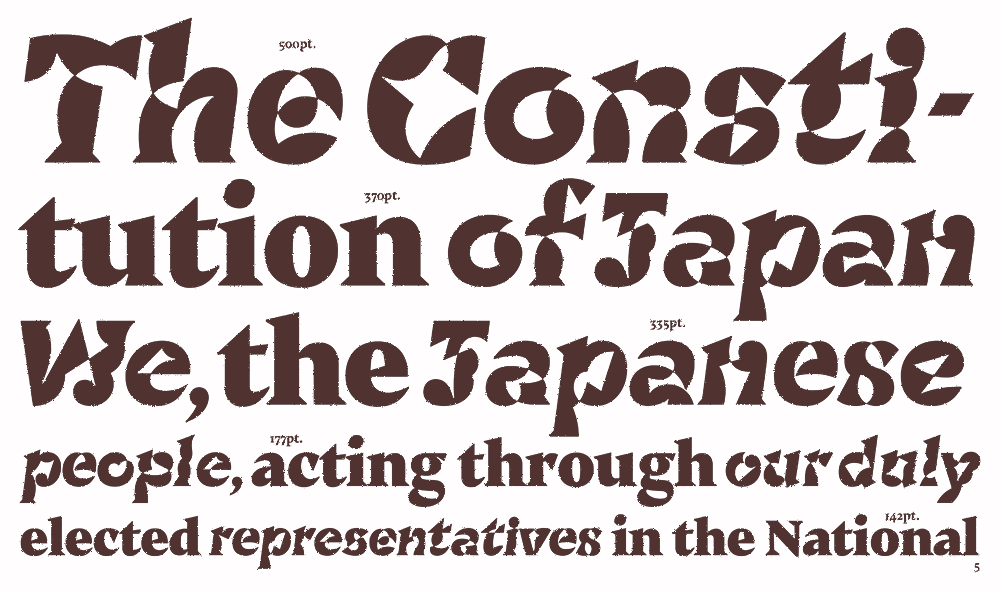
Groq by Tezzo Suzuki
“Today, we use italics to graphically highlight a word or phrase in a language other than the main text. A main voice unfolds a story, but from time to time, a second voice, a partner with a slightly different timbre, can be heard. Through the magic of a new set of drawings, we intuitively understand something that goes beyond the meaning the words expound, and the invitation of a second language is self-explanatory. The idea, the invention, is itself incredible. How many chances did we have that, by chance, the history of writing would give birth to the diphony2 of the text? Some think it is a matter of being worthy of this gift. To make it bear fruit. That we must give in return. For the contemporary idea of italics is the root of a multitude of new questions, one of which is of course: could there be different “flavors” of italics, each one unique to the language it features? Tezzo Susuki with Groq, sketches an answer for Japanese, with a variant which by its very form tries to give to a Latin script a reading feeling proper to kanji. Each letter has 5 alternates, all built by an infinite loop drawing, and thus has neither inside nor outside. The typographic patterns are not those of rigid, metallic, mechanical modules, but as if traced by a supple and aerial brush, punctuated by harmonious counter-punches. We are very far from the principle of imitation, of caricature of an aesthetic. Tezzo does what Deleuze enjoins us to do when we want to be creators, when we want to speak a common language with a language of our own: not to pretend, not to act or imitate the child, the madman, the woman, the animal, the stutterer, or the foreigner, but to become all of these, to invent new forces or new weapons. He speaks an accented Latin through not what should be called an italic (which Groq also has), but a nipponic.”
Once again, my gaze wandered, this time to all the already-filled breaks. Did each one really enclose a character of the same caliber? -̹͚͗͒͒ͭ͞Ḧ̷̗̻̘́̏̎A̦͈̓̈͡-̴̙͕̦͈͔̗̖̅ and the other people behind this project, are they hunting for all the wacky typographic projects? Why not make their work go public?
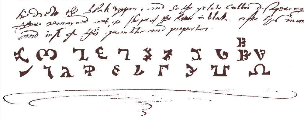
“We gather here the characters that create new functions, that endow the text with new potentials, and this since 1536, under the impulse of John Dee, scientist of the British court of Elizabeth I. That year, he and Edward Kelly, an alchemist and medium, decided to perform theurgic rituals3 through trance in the hope of making contact with what they thought were angels. If we don't like Christian imagery, we could say... Extra dimensional fractal entities, some kind of machine elves4, you know? Their only wish was to come into possession of the Adamic alphabet, the primordial creative writing, the one Adam had used to name everything. But when they finally reached an angel, it taught them that the Adamic script was just another human fantasy. Not a reality. It did, however, give them a gift. It downloaded an intuition from which they could never detach themselves: the absolute certainty that the forms of human writing were only in their infancy, and that what they took for the peak of evolution from the top of their imperturbable humanism, was only the tiny summit of an alphabetic iceberg that humanity had to explore by itself. It also offered them the Enochian, a font capable by its design of helping to recontact them to continue to dialogue, a shortcut simplifying the laborious rituals they had to put in place for this first contact.”
Enochien by John Dee & Edward Kelly
“John Dee, then galvanized by these new feelings that showed a fresh perspective on the possibilities of writing, made many attempts to educate the people on a more mystical view of writing. But he soon gave up. The battle against the inherent globalization of writing was already underway at that time. An open war, doomed to failure, gave way to an underground guerrilla war. As early as 1536, he decided to found the Order of World King's Romans, which would each year select a character who had made writing advance in a quest for exploratory diversity. For almost 500 years, we have been collecting the most incredible characters. Treasures, talismans, which sometimes fell into our hands and others that we went to dig up in places forgotten by the eyes. Some of the fonts here are, of course, known to the general public, but most of them have been forgotten. Too fragile to withstand the merciless test of time. But all of them, however, just like Groq, invent new ways of envision text.”
-̹͚͗͒͒ͭ͞Ḧ̷̗̻̘́̏̎A̦͈̓̈͡-̴̙͕̦͈͔̗̖̅ grabs another key, opens the lowest case of the cabinet, and contemplates another character. “Meros, 1868!” He pulls several characters from the case and, using some unknown mechanism that the distance prevents me from seeing, clips them together in sequence. Once the word is composed, he takes out of his pocket a small thick paper on which he centers his composition. He places them delicately on a work surface cut into the wall, then hands me a pair of sunglasses. “You'll see,” he says, as if in response to a palpable lack of understanding. We both put on our glasses as the lights go out. We can't see anything anymore. In the darkness that has become total, I hear a click, a few beeps. “I think 8 seconds will be enough.” Then, in the middle of the silence, the letters light up. A slight smell of burnt paper fogs up. I now notice a more complex structure hidden in the core of the quartz leads. I see the letter, shining, but also a whole set of lenses leading the light like veins, from an optical fiber coming out of the ceiling to the smallest serif. Lights turn back on, and we take off our glasses while he hands me the map. In the middle of large white margins, the letters “O,W,K,R” are now printed in a deep brown color with extremely soft contrasts. I can't say why, but the letters ooze the exact atmosphere of the place we are in. They exude claustrophobia, excitement, darkness, light, treasure and magic all at once. Just as an art-deco typeface could somehow take us back to a Paris of the 1920s, except that it would be impossible for me to say what it is about these letters that causes this effect. It was as if these malicious illusionists had used a subterfuge known only to their designer to achieve their ends.
“When a person sees the Meros for the very first time, its curves become irreversibly charged with the memory of the place at the time of its first reading. This is my gift to you who have come here. Whenever you want to experience the feeling that you now have, read these letters. By dint of it, you may end up understanding the tricks Hippolyte, its designer, used to achieve this miracle.”
-
The World King is a myth popularized by René Guesnon, a 20th century esotericist. It suggests that a man is the mystical world teacher, hidden in Agartha, a city at the center of the Earth. ↩
-
Diphony is the ability for a voice to play two notes at the same time. ↩
-
Theurgy is a form of magic, which would allow man to communicate with the «good spirits» and to invoke supernatural powers for the praiseworthy purpose of reaching God. This practice is opposed to goetia. ↩
-
Theorized by Terrence McKenna, machine elves are entities frequently met by many people during the consumption of DMT or hallucinogenic mushrooms. It is said that these encounters are without dialogue and that feelings and knowledge are downloaded and installed in us by the entities. ↩


