Type : Fiction
Release : 14 July 2019
Auteur : Benjamin Dumond
pdf : awanpmjadb.pdf
apa : Dumond, B. (2019, 14 Jul.). A font in a dream. Grifi.fr. /en/articles/awanpmjadb
“A font in a dream” is a text published in “L'Expérience du Récit” #5, ESAB Lorient in 2019. It's a short fiction of a dream story featuring Adisson Dwiggins, about the creation of a character carved from another, with fantastic properties.
Dream of the night between July 13 and July 14, 2018:
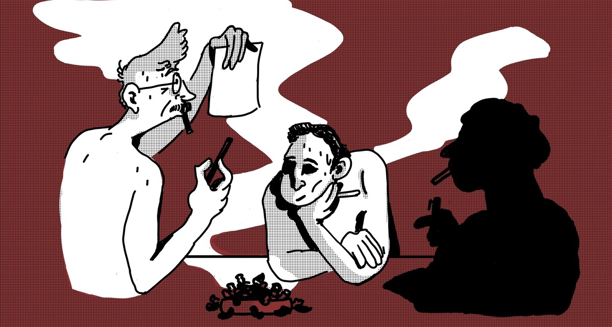
Dining room at my parents' house, Nîmes, south of France, 42°C. Addison Dwiggins, my brother and I are all in our underpants, around a big table on which a bunch of letter drawings are spread out in a mess. A red light filters through the lowered blinds and gets lost in a maze of smoke, emanating from hundreds of cigarettes on the floor.
Despite the thick heat, no one is sweating. Dwiggins stares at his drawings, while we stand by and watch the master at work. Where are we? Who are we to be allowed to watch him execute his next posthumous work? Are we guests or squatters? We keep quiet.

( 0 _ 0 )
The man walks around the table. He clicks, looks, modifies and sometimes stops to explain something out loud. Not to show off, nor to be educational, but because he can't help it. He alone takes the measure of what he is about to accomplish, and, so intensely thrilled, he can't help but to share his excitement in an archetypal American-ish attitude. Floating in a steam room atmosphere, we feel both held captive and exactly where we belong. The mechanics of the scene seem perfectly oiled.
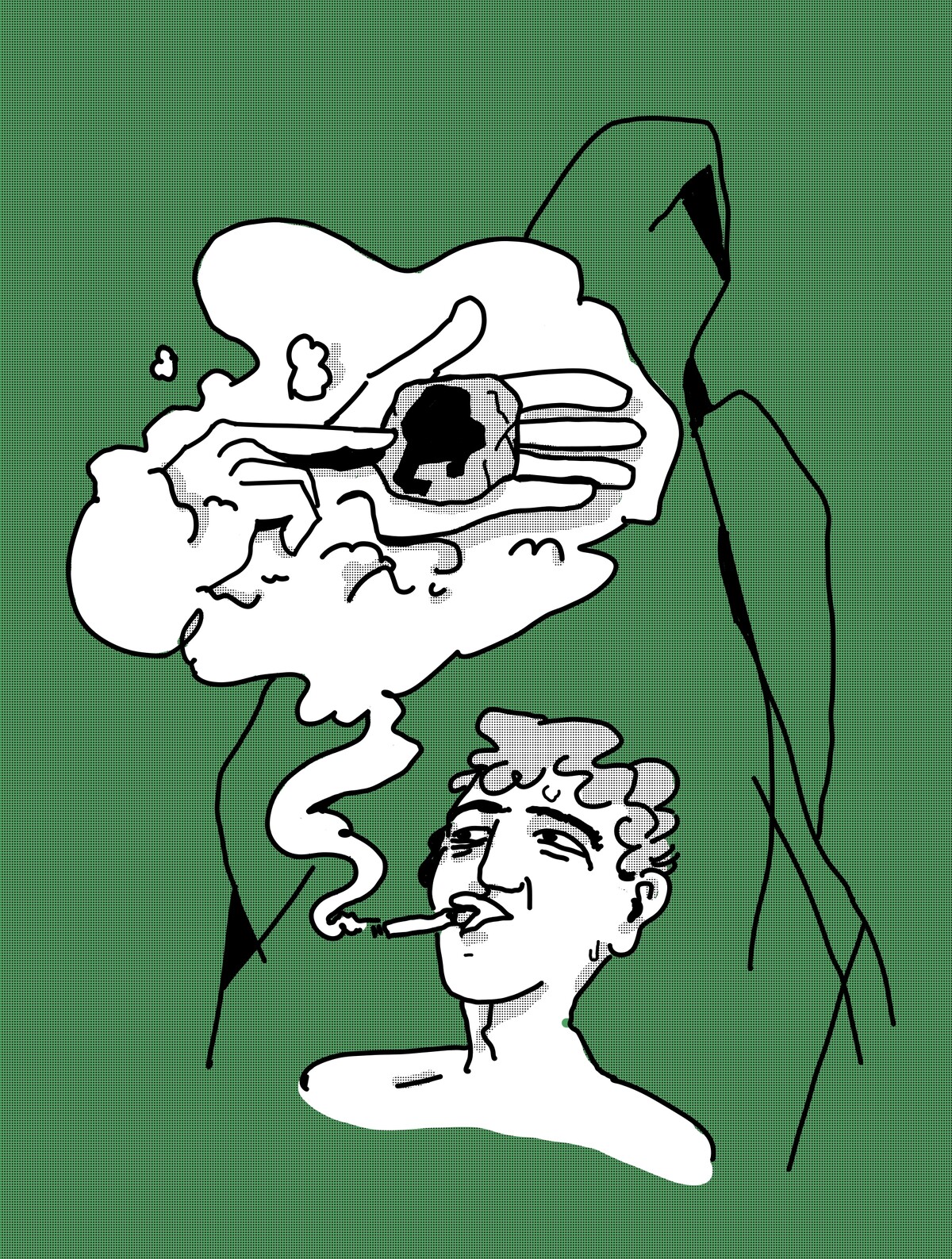
Taking a puff, the man savors his burgeoning character for a few seconds.
One can clearly see a sort of lively body text lineal with vibrant stems, whose clarity is surprising considering how irregular letters are. Its expressive black drawings make each glyph dance in a unique way while orchestrating them around a common choreography.
A.D. — “Last night I asked Mr. Berth to let me wander around the paleontology section of the Natural History Museum after closing time. I do that all the time when I'm stuck in my work and have never come out without knowing what I was supposed to do.” He deeply stares at the end of his cigarette ember.
“I have a theory about that. Maybe every time we think we're creating, we're really just uncovering something. Something already there, waiting for us, ready to be discovered by us and no one else. It would then be enough for us simply to honour the encounter.” Juggling his cigarette between his fingers to land it in his mouth, he then pulls a small rock from his pocket. “It's exactly like this rock. I saved it yesterday morning from a dog that was going to pee on it. When... bam!” Tapping his other hand with an engraved hammer, the stone split open, revealing a small black trilobite. The slight chance that there was indeed a fossil in this stone strikes us so much that we cannot help but stare at the type designer when he tells us, "There is no difference between this stone and a letter."

( 0 _ 0 )
Determined to convince us, the master grabs a blank sheet of paper on which he draws the perfect outline of a character I think I recognize. He then fills it with deep black ink, leaving no doubt as to what I am looking at.
A.D. — “Universe 83 - Extended Extra Black - by Adrian Frutiger. The lineal of lineals, which, by the way, was supposed at first to be named ‘Le Monde’, the world. Like the last major arcana of the tarot. They must have thought that would have been a bad idea. It would have made what I just discovered far too obvious.” He then takes the sheet of paper and cuts into the character with a smooth gesture, but without following its contours. A new letter then appears, literally extracted from the first. “It was there for a while I guess... I just had to remove all the fat that had crystallized around it. I barely did anything, look, it just falls out.”
He raises the sheet with both hands and shows us an “e” with a mocking expression. I had never paid attention to it, but it now strikes me and, if I stare at it, I can clearly see the “e” laughing at me. That “e” breaks the fourth wall. He's aware of who it is, it sees me and lets me know that, compared to it, my life is pretty ordinary.
A.D. — “HopHop.”
The designer rotates the letter and glues it to a new sheet, which he sends on a pile labeled “final glyphs”. The remaining parts of the letter are then swept to the ground. I imagine he won't throw them away and will use them to make his italics.
A.D. — “Warde screwed us up big time with her crystal gobelet idea. It was too powerful! That article was the most masterful modernist ritual. After that, type was just a container, just a communication tool. And now, most revivals have no more value than the transhumanists of Silicon Valley, whereas... this font here…” He points to the table, looking at its vibrating stems character, and continues: ”it's more of a black obsidian kind of goblet, you know?” We pretend to understand. ”And this…” he pauses, taking out a large black cardboard sleeve, “This is its content.”
Mechanically, he pulls out a whole bunch of drawings of ligatures. Quite a lot. I count about a hundred, then lose count. Some sheets have only one drawing, while others are full of them. I catch a few: “dens”, “colo”, “bin”, “sub”, “navy”, “etc”. Dwiggins then spreads them out in front of him, all excited.
“There,” he said, pointing to one of those assemblages of letters. “Are you lost?” His finger smoothly traces the letters one by one, going up and down with confidence to outline a design that, although in perfect graphic continuity with the rest of the font family, also seems deeply different to me. Close but independent, all made of curves but with sharp ends.
“Noct”, Dwiggins tells me. “It's a prefix from the Latin word Nox, the night.”
The ligature itself is not illustrative, but now that I know it refers to the night, it's impossible not to see it. How can such subtle changes to a group of characters (just a few dots shifted) manage to imprint such a descriptive image on my retina? It was the first time I saw letters that could set such an atmosphere.
The old man reached across the table to grab another ligature at the opposite end. “How about you take this one and place it next to the other... right... there”
Faced with the two juxtaposed ligatures, I felt like the spectator of two superimposed scenes. One I knew well, that of the letters, the text and its meaning, but I could also clearly make out the silhouette of a person moving forward in the dark.
A.D. — “Noctambule, composed of the previous ligature, plus ambule which in Latin means ‘to walk around’. Strange feeling, isn't it? This font changes the look of a text in depth. Each Latin etymological root has been given a ligatured form in the spirit of what it defines. No text has ever been so alive. It moves. It is like a film. Each word becomes a playlet, a comic strip box filled with hundreds of objects and characters. Isn't it obvious now that our letters and the groups they form are literally generous actors who have been playing for us for thousands of years? In this world of the paragraph, their lives are beyond our control. Which exposes another great truth: in every story we write, in every text we are so sure to have authored, there is a secret, kaleidoscopic play being played out, constantly reinvented.”
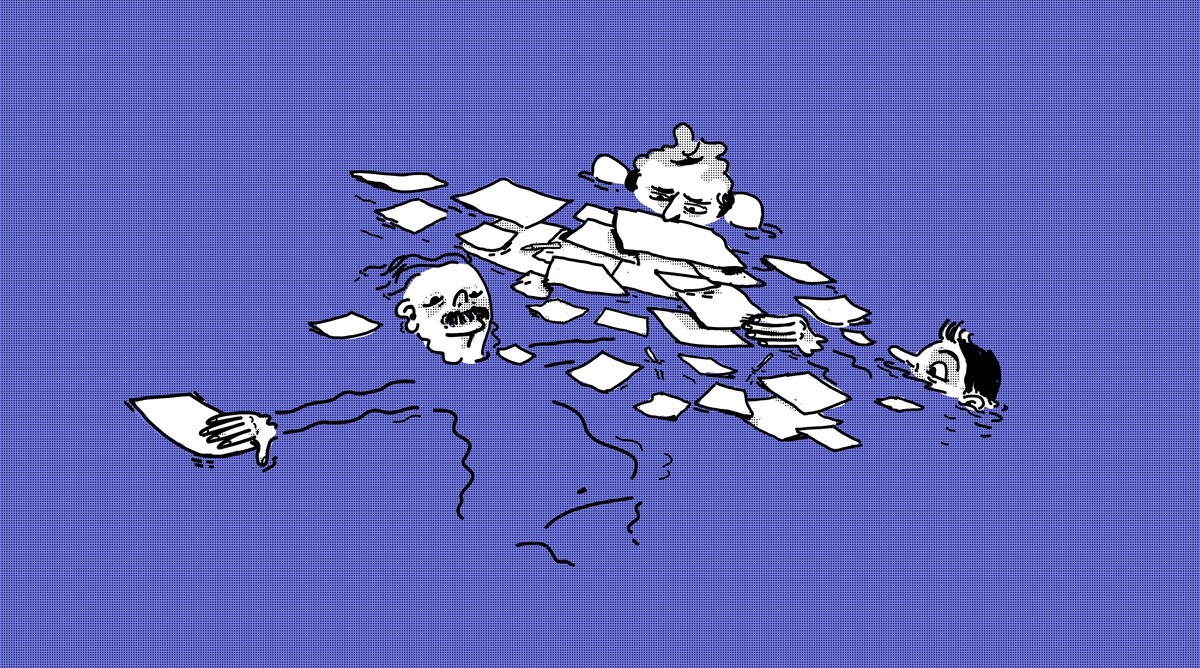
The steam in the room becomes dense and the old man's words become muffled. I feel as if I am now watching him play with his ligatures as one would play with string puppets, miming several voices. I find the image distressing and am relieved when it finally disappears completely. I am floating in an in-between.

( 0 _ 0 )
I wonder if, when I wake up, I will remember that glyphs are alive. I think about semantic satiety. By repeating a word too much, it eventually loses its meaning. _ All work and no play makes Jack a dull boy. All work and no play makes Jack a dull boy. All work and no play makes Jack a dull boy._What happens to letters when you free them from the function they have occupied for so many years? I turn this idea over in my head for a few minutes and end up telling myself that there is little difference between our glyphs and workers repeating the same gestures over and over again, with the sole aim of satisfying our desire to read. If they were to unionize, perhaps we would finally see that letters, even if deprived of their meaning, are not empty crystal cups, but are rather full of a liquid that we simply cannot yet perceive.
Emerging from my semi-sleep and without really understanding why, I take a few seconds to thank the analog numbers on my alarm clock.


